55 Roots LLC
Project Description
The primary objective of this project was to develop a compelling visual identity and logo for a New York based consulting agency "55 Roots LLC". The challenge was to transform the numerical essence of "55" into a brand-defining element, capturing the company's essence with earth tones, warm hues, and fluid, organic shapes. The specified criteria included incorporating simple, bold, and easily readable fonts.
55 Roots LLC operates in three key domains:
Create: Empowering creatives to discover their potential and grow professionally.
Connect: Facilitating connections between creative individuals and businesses.
Consult: Providing strategic guidance and business development support for creatives.
Our approach
Our focus was on artists and creatives navigating the expansive world, seasoned artists seeking growth, and business owners eager to collaborate with artistic talents.
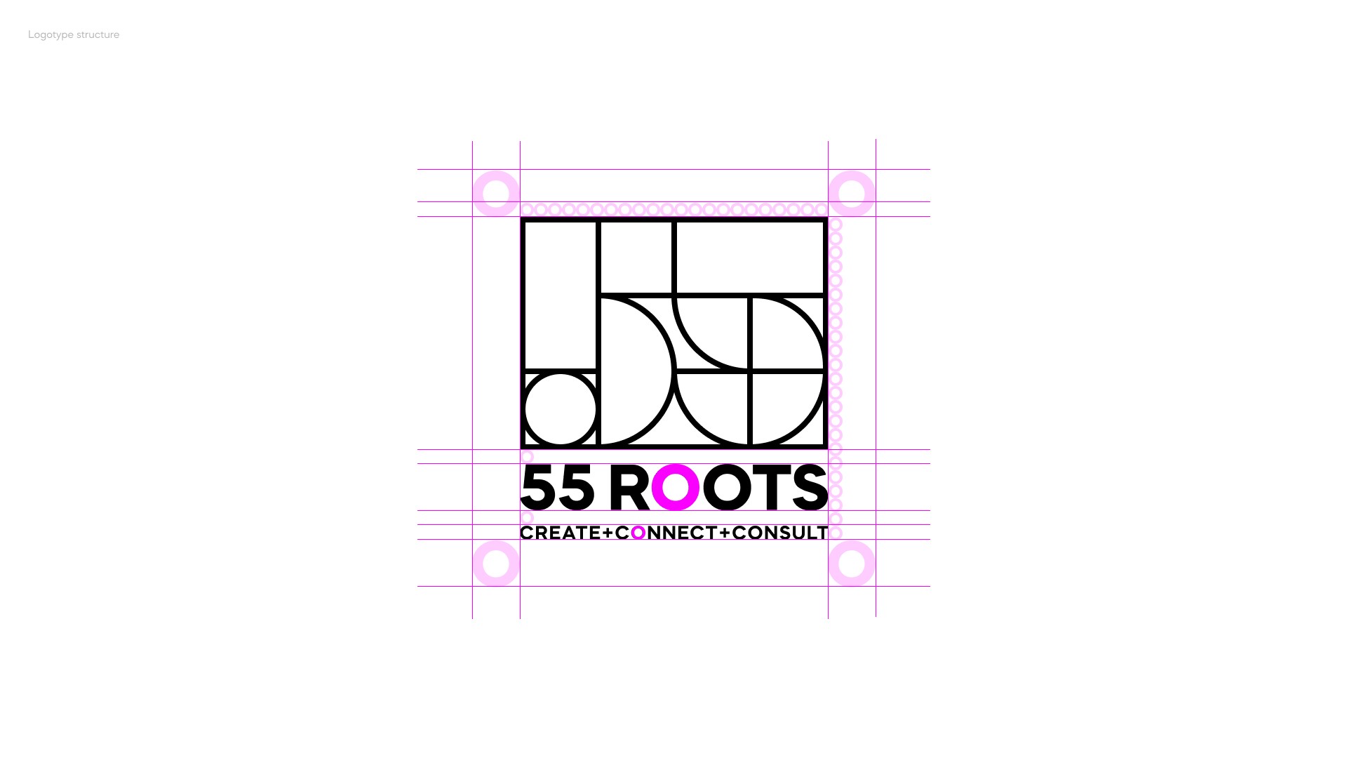
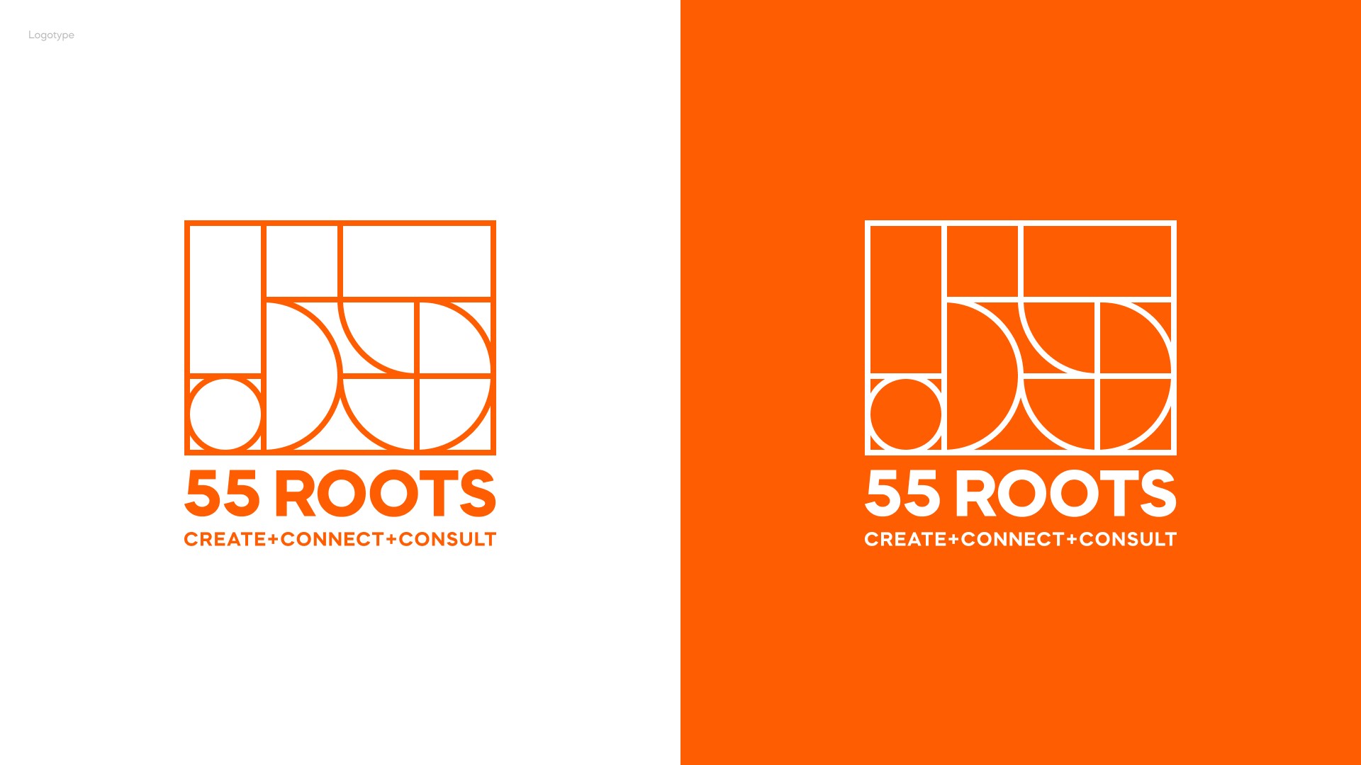
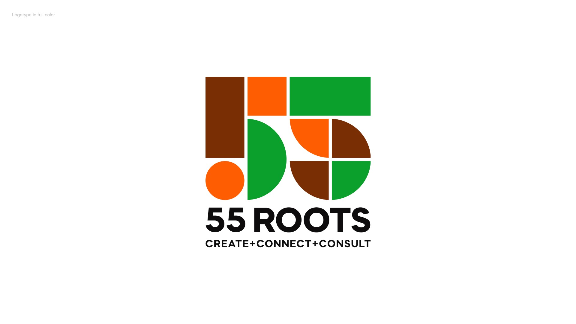
In aligning with the brand's vibrant energy, we selected bright orange as the primary color. This choice not only differentiates 55 Roots LLC from competitors but also establishes a memorable brand presence. The logo design, composed of geometric shapes forming the number "55," symbolizes creativity, passion, and an open-minded approach. Accompanied by the tagline "Connecting the dots between business and creatives," the visual identity communicates the brand's mission clearly.
Results
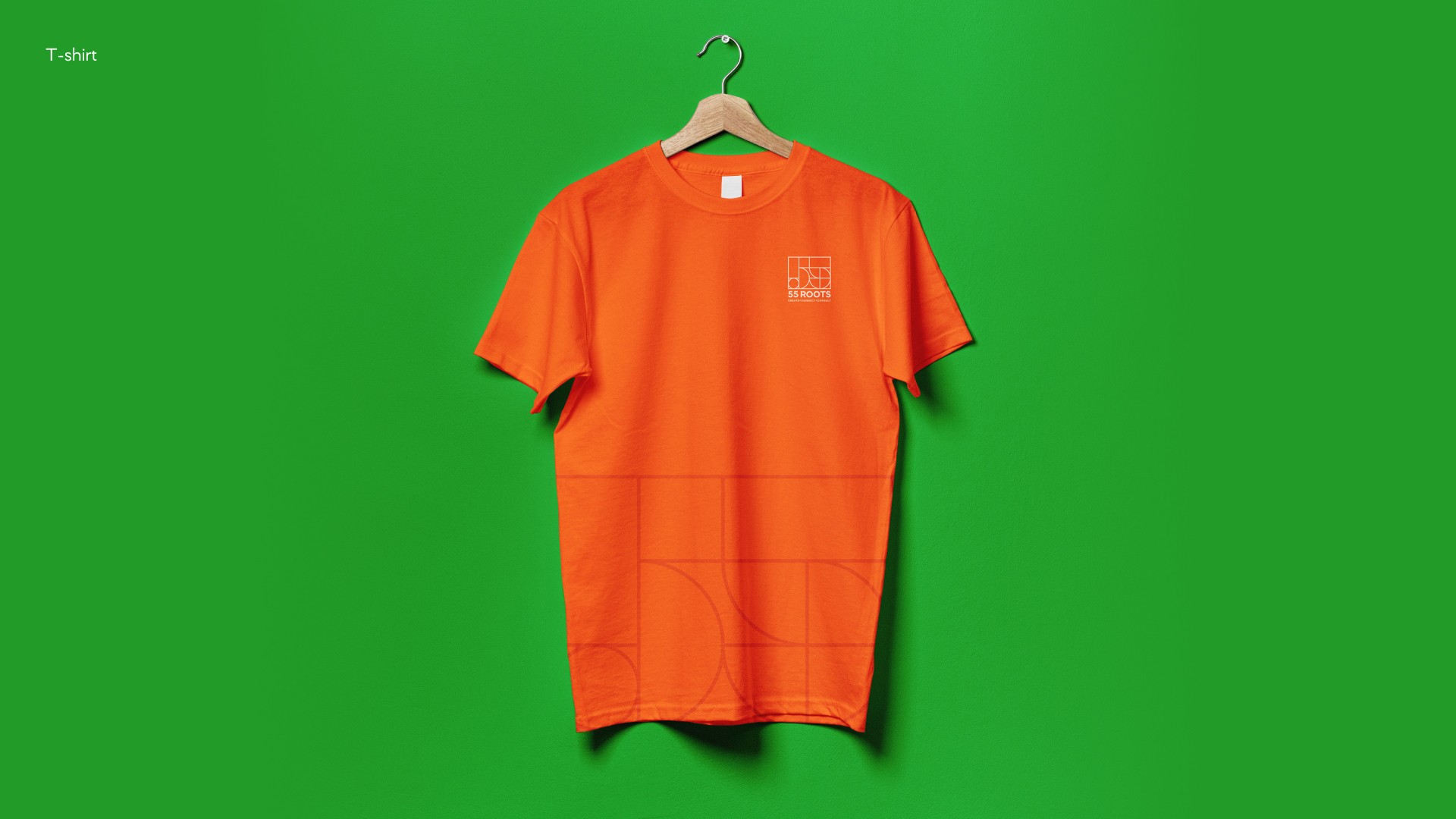
The implementation of the new visual identity resulted in significant brand recognition at industry events, contributing to 55 Roots LLC securing several contracts within the initial month. The distinctive branding successfully positions the company as a dynamic force in connecting the realms of business and creativity.
Industry
Consulting
Tech stack
Illustrator, Photoshop, Figma
Services
Timing
1 month


