Project Description
In response to its dynamic growth, Erteh, a prominent player in the energy sector, embarked on a comprehensive rebranding initiative.
Project Objectives:
Our studio was tasked with revitalizing the company logo, infusing a modern, dynamic essence suitable for diverse formats.
Design Strategy:
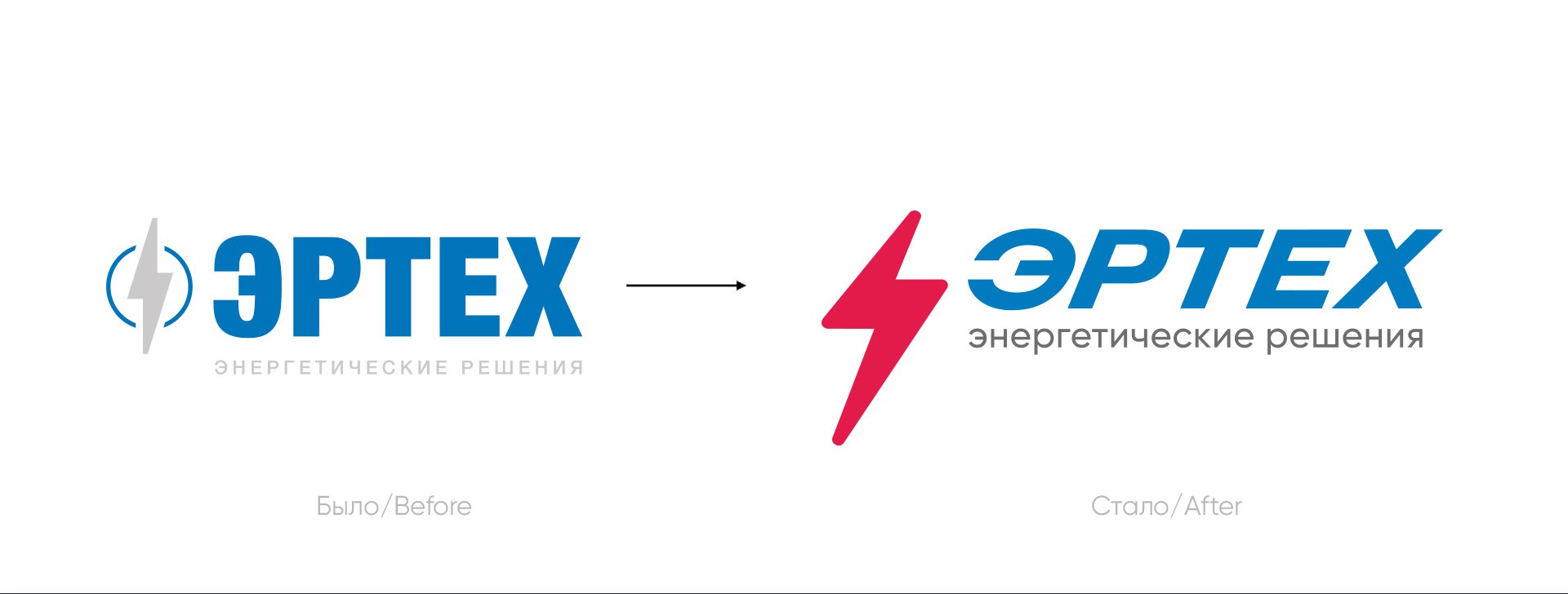
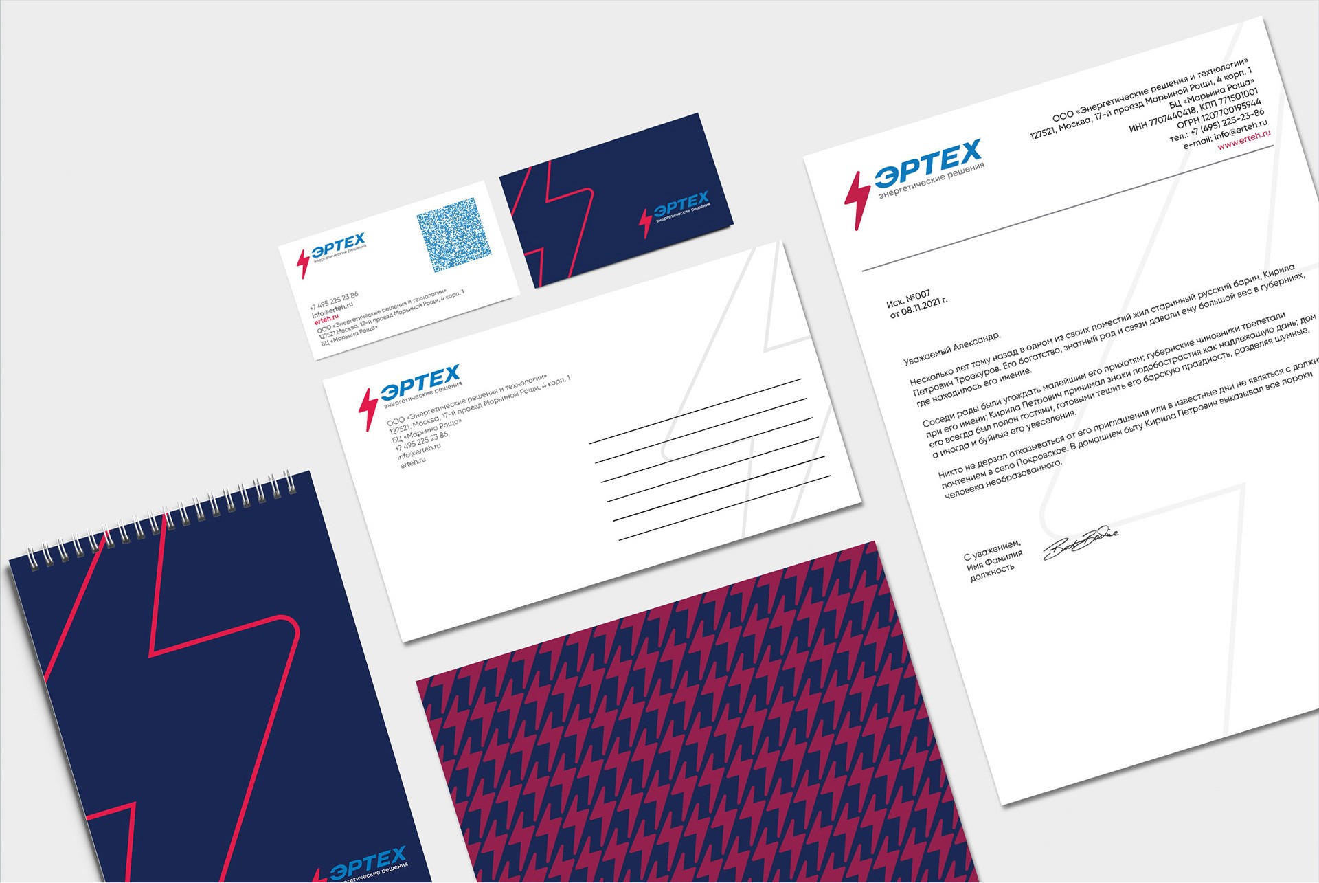
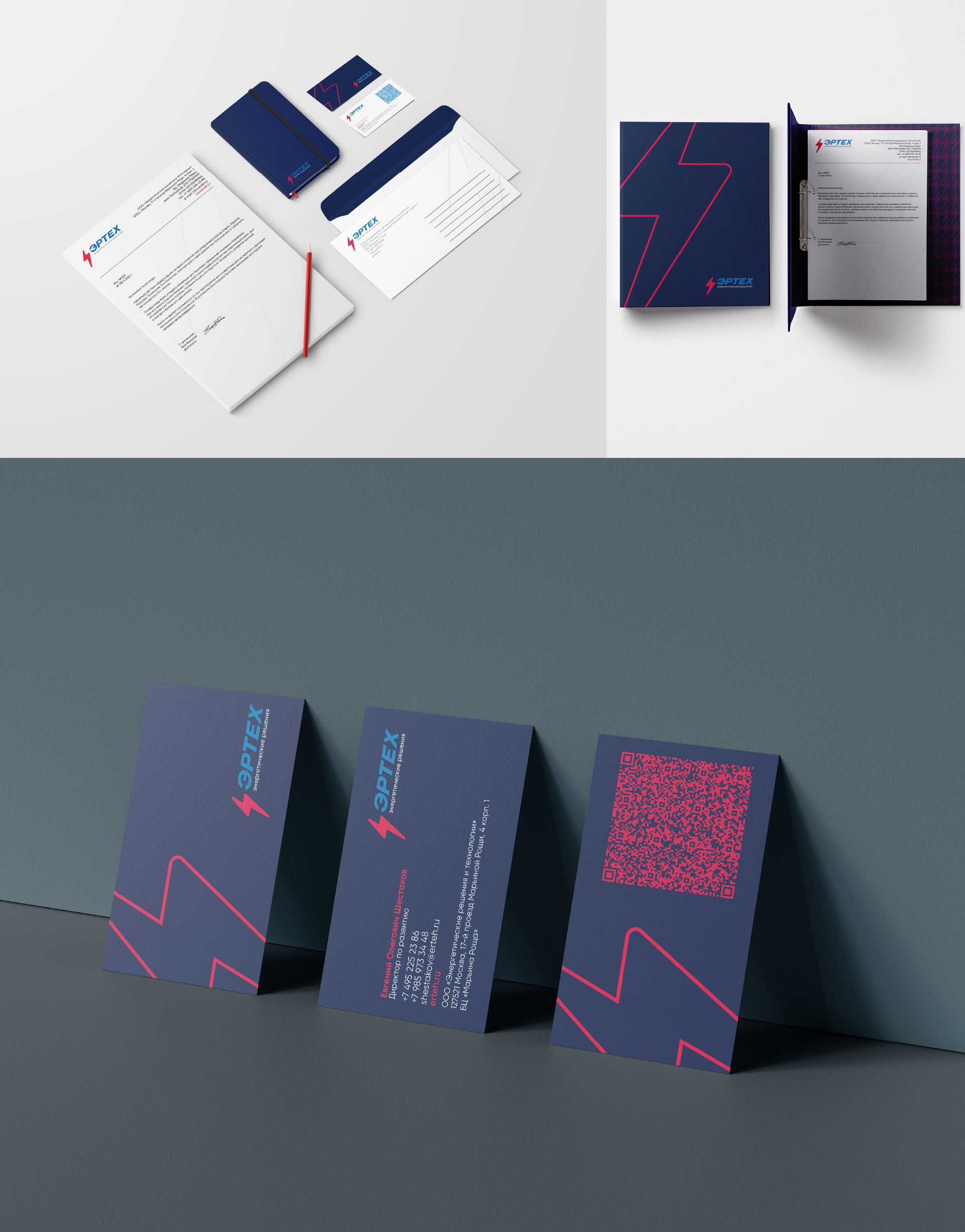
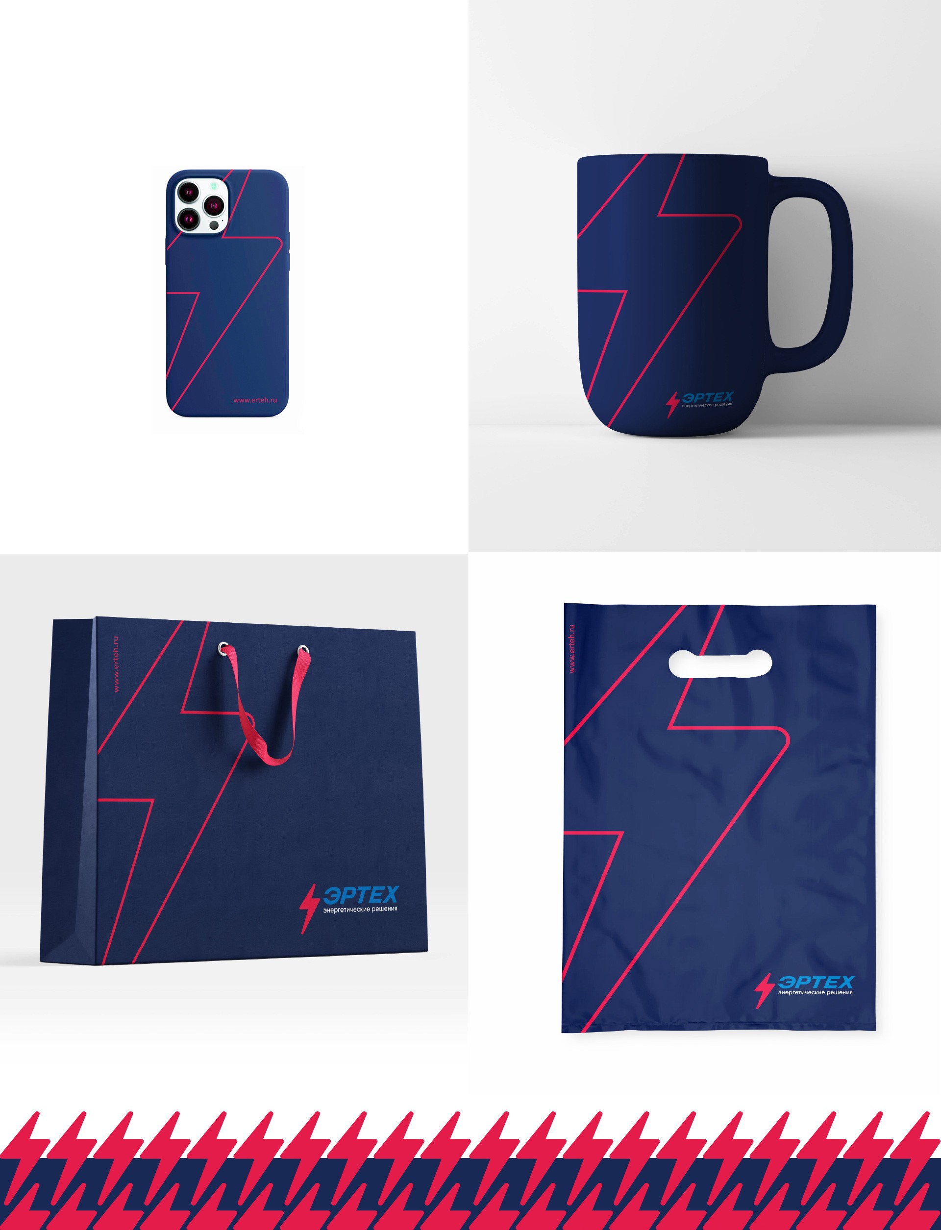
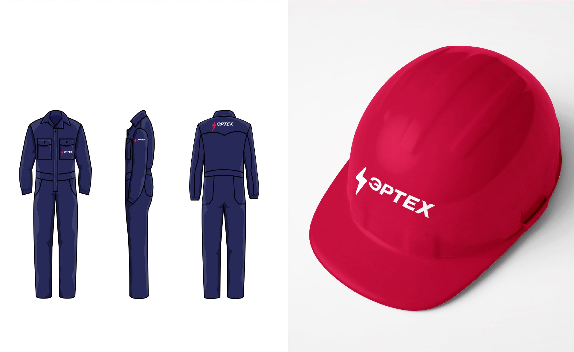
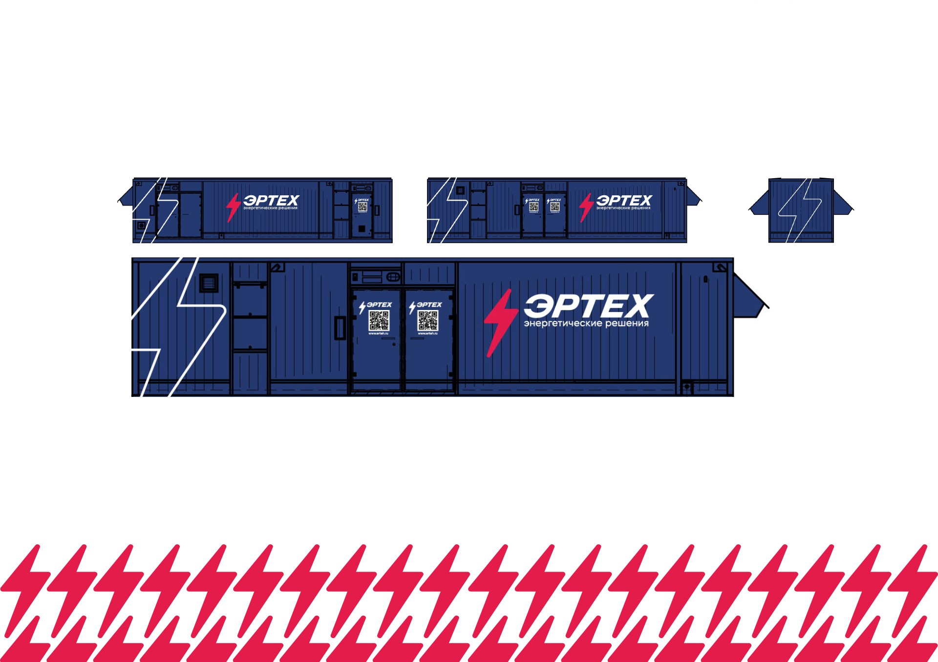
While preserving the lightning bolt symbol and the primary blue color to ensure brand continuity, our team introduced a contemporary update. The hue of blue was refined, and a vibrant red color was strategically added to the corporate palette, symbolizing energy. The lightning bolt underwent a complete redesign, adopting more approachable round shapes, enhanced dynamism through diagonal inclination, and a streamlined, concise form. This redesigned lightning symbol evolved into a standalone element within the company's identity, now featured in branded products as both a pattern and emblem.
Innovative Elements:
A subtle yet impactful addition was the silhouette of a wrench cleverly integrated into the negative space of the logo. This discreet symbol represents Erteh's technological services and adds a layer of depth to the brand identity.
Results:
The strategic rebranding by CHYRKOV studio not only modernized Erteh's visual identity but also enhanced its versatility across various applications. The nuanced design elements, such as the redesigned lightning bolt and the subtle wrench silhouette, contribute to a cohesive and multifaceted brand narrative. This case study highlights our ability to implement strategic design decisions that align seamlessly with a company's evolution, ensuring a refreshed and impactful visual identity.
Industry
Energy
Tech stack
Illustrator, Photoshop, Figma
Services
Timing
1 month

